
This year, I continued with the Nutcracker theme for my holiday greeting cards, with another scene from the story – the battle of the Mouse King. I had decided last year that I wanted the next character I showcased to be the Mouse King but that was all I really knew. I made a rough sketch but as I started making the card, the design kind of evolved on it’s own. The whole process was organic, much different from what I’m used to. In the end, I was happy, and surprised, with the results – surprised because I had so much doubt in the beginning.
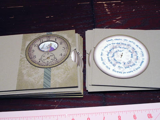
So without boring you with my whole thought process of how I got here, here is my card and how I ended up making it. The type of card is called a View Master card, though I didn’t know that’s what it was called when I made it. Basically, you have a disk with images on it that is attached in the center to another piece that has a window. As you turn the disk, the image in the window changes. On the other side of the disk, I put a quote from the Nutcracker by E.T.A. Hoffman.
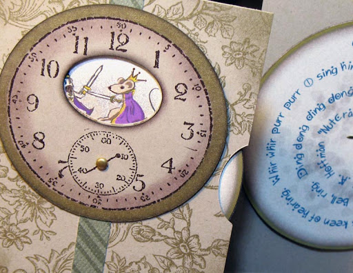
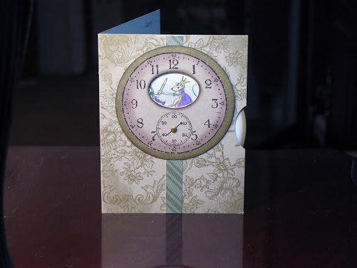
Outside and Inside of the card:
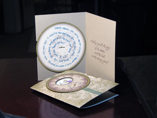
The card in motion:
Materials Used:
- SU Kraft Card Stock
- SU Vanilla Card Stock
- SU “Sens du Temps” stamp
- SU “Bella Toile” background stamp
- SU “To the Nines” DSP
- SU Chocolate Chip Classic Ink Pad
- Gold Encore Ink Pad
- “Mouse King Battle” original artwork by Me
- Holiday sentiment stamp
- Gold mini-brads
- SU Pop-up Glue Dots
- Aileen’s craft glue
Tools Used:
- Ink Daubers
- Fiskars Ultra ShapeExpress with circle and oval templates
- EK Success Circle Scissor Plus
- Crop-a-Dile II Big Bite Punch
- Tablet PC
- Injet printer
- Photoshop CS2
- “Starry Night” font by Laura Ashpole
Creating the Artwork
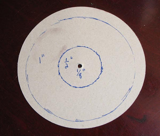
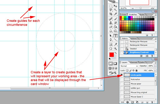
To create the artwork, I first made a mockup of the card so that I would know where the window would be and what part of the disk would be showing through it. Once I made my mockup, I put a pen through the window and kept it there as I moved the disk. I did this for the top and bottom of the window. From that, I determined my measurements:
Then in Photoshop, I created a file with each of the characters I wanted on the disk – each character in their own layer pairs. This was done at a higher resolution than the finished artwork because it’s easier to get rid of data than to create data from thin air, should I make the graphic too small.

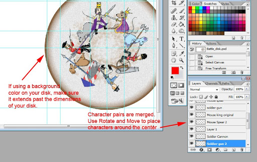
I copied the file, and in the copy set up the guides for the disk, merged the pairs of character layers, and placed them around the disk. If you do this and are going to use a background color on your disk, make sure the color extends past the dimensions of the disk. This is called “bleed”, and it’s to ensure that if you don’t cut out the artwork in a perfect circle, that there won’t be any white crescent-shaped edges where the color didn’t reach.
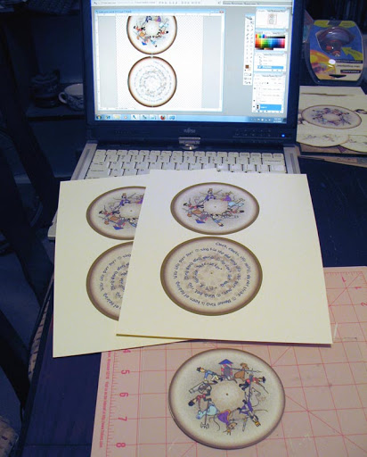
I then created the back of the disk, which has a quote from the book, shaped in a spiral. I printed the front and back disks on to Vanilla Card Stock, cut them out, and daubed the edges with Chocolate Chip ink to hide the white cross-section of the paper. Then I glued the backs and fronts together. The quote says:
-
- Clock, clocks, whir softly, do not strike.
-
- Mouse King is keen of hearing. Whir whir purr purr
-
- sing him the old song whir whir purr purr,
-
- Ring, bell, ring. Ding dong ding dong.
- He won’t last long.
– E.T.A. Hoffman “Nutcracker”
My Philosophy About Digital Artwork
-
- I love drawing and painting on my tablet PC. If I had more time, I could have done a better job and made it look less cartoon-y. There has been some argument as to whether digital art is as “good” or as “real” as traditional mediums. I can tell you, having experience in both, that it is. Like anything, there is a learning curve to get over the technical aspects of computer graphics. But
once using the software becomes intuitive
- , picking up a tablet pen is no different than picking up a stick of charcoal, or a paintbrush.
Creating the Card
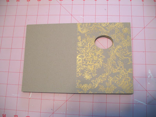
I first cut my card stock in half, then scored each piece down the center. Using a plain sheet of paper to mask the left side, I stamped the Bella Toile background stamp with Gold ink. I then cut the oval window out.
I used a dauber to sponge gold ink at the corners of the cards, then cut strips of DSP and glued them to the card
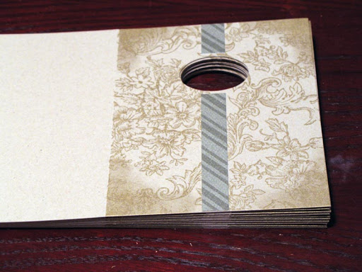
I stamped clock faces on Kraft Card Stock, without including the clock hands, then cut ovals in the top half of the clock. In the story, the battle takes place at midnight, and the hands were permanently fixed at 8:17. Making individual hands would have been a pain – that’s how I came up with the oval window idea to take up that space.
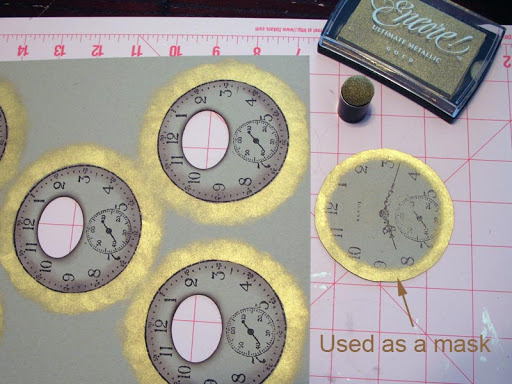
With a lightly-inked dauber, I used a sort of flicking motion to color the inside of the ovals. I then used a rubbing motion with the dauber to apply color to the outside edges of the clocks. This will give a nice gradient on the inside – it doesn’t matter if color goes past the line because it will get covered in the next step (this only works if your next ink is opaque.)

I stamped an extra clock face and cut right along the outside edge of the circle. This circle was used as a mask. I placed the mask over the real clock, and daubed Gold ink around the edges, making sure to extend past the dimensions of where I will cut the outer circle.
I then cut out the clocks. They are looking pretty good at this point but kind of flat.
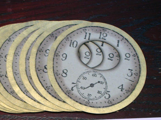
To add dimension, I used a dauber with Chocolate Chip ink to “flick” more ink along the edge of the clock.

I used Glue Dots to affix the clock faces to the cards.

I punched a 1/8″ hole in the center of the disks and secondhand clock, separately, so I could make sure they were centered. And finally, assembled them with a gold brad.

This card is absolutely gorgeous! I would like to include it as a window in the Craft Shop's Advent Calendar widget if I may. The Calendar will link direct to your blog entry, so you will get all the credit.
You can see the Calendar here: http://www.freeadventcalendar.blogspot.com, and can also copy it to your own blog if you wish.
If you have any objections to me including this project in the calendar then please do get in touch, but I hope you are happy to be included because I think it is FAB!
Claire Butler x
LikeLike
Hi Claire!
I would be honored to be included in your Advent Calendar app. I will also add it to my page a little later (I'm still at work.) 🙂
Thank you so much!
Cynde
LikeLike
Thank you!
It will probably appear in tomorrow' window. I hope it generates some welcome traffic for you :o)
LikeLike
WOW. You are so creative and the card is an absolute treasure! 😀
Marie
LikeLike
Aww thanks Marie! I think it runs in our family. You're pretty creative yourself! 😉 So who do you think was the artsy-craftsy one – Grandma or Grandpa? 🙂
LikeLike
Good question! Too bad the chance to learn something about them past us by years ago when Yayay died … Maybe Auntie Purita remembers something. If either one of us gets the chance, we should interview her!
LikeLike
Cynde, that is a lovely piece of artwork. I agree that digitally created art can be just as good as “handmade”. The real advantage in this case is being able to control the whole process of putting it together, without messing about with scanners etc.
The card is definitely a work of art! If I received one like this, I think I'd keep it for ever on a special bit of my shelf, so I could show it to people and look at it often!
LikeLike
Marie – We should! I heard talk of wanting to do the BIG family reunion thing this year. I'm not sure if that's going to happen though, but it would be cool if we could all get together again. 🙂
LikeLike
Aww, thanks Lizzie! 🙂 And also for supporting digital artwork. Honestly, when I reproduced my artwork last year by scanning and printing it multiple times, I did feel like I was “cheating”. But I soon got over it. Lithographs, wood blocks, and photography are reproduced multiple times, so why should this be any different. 🙂
LikeLike
What a fabulous card thank you for sharing the process. and thank you for joining our advent calender. Merry Christmas.
LikeLike
Thanks, Juliet! It's an honor and a pleasure for my card to be included with all the great crafts in the Advent Calendar. So many inspiring things there!
LikeLike
It would be great to have another reunion! Hey, thanks for sending me a card! LOVED it! Hope you're having a great holiday season. 🙂
LikeLike